BOOK DESIGN
Anna Fábri: Golden Ages | Fábri Anna: Arany idők
Publisher: Kortárs Könyvkiadó, Budapest, Hungary | 2022
Cultural historian Anna Fábri has spent almost ten years researching the pedagogical practices of the Count Teleki family. The focus of her book is the childhood diary of Count László Teleki (1811-1861) and The educational advice of his father, József Teleki. She traces the links to ever-changing educational doctrines, ideas and places, and presents the educational institutions and methods of Pestalozzi and others, as well as Göttingen, the contemporary stronghold of Protestant university education. Unpublished letters, documents and reminiscences give the reader an insight into the religious culture of the Teleki family, their social life, reading, conversations and games, the family itself, the prematurely widowed mother and guardian, the much older brother, the first president of the Hungarian Academy of Sciences.
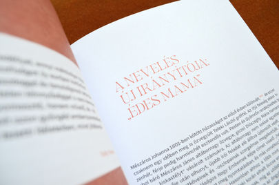
The classic look of the book is a visual link to the theme of education. It follows the author's writing style, in which the scientist's rich historical knowledge takes the form of a seemingly light narrative. The book is therefore intentionally non-archaic in its choice of typeface and colour. It is serous, in that the main purpose of the modern layout is to aid readability, as the book is almost 400 pages of academic work. It is playful, for example, in its repeated use of salmon colour and in the intertextual placement of archival images and documents to reinforce the descriptive tone of the text.

"The title of the book is as appealing to the prospective reader as its understated and elegant design. Tímea Andorka is to be commended for the sophisticated design, which is in keeping with the subject of the book, the period analysed and the author's personality. It is also worth emphasising that her work is not only aesthetically outstanding (special mention should be made of the perfect pagination), but that the designer's more practical(ish) solutions also help the reading experience. For example, the idea of colour note numbers to make the text easier to read. This use of colour is also a feature of the other indexes, including the bibliography and the table of contents."
A kötet a címével éppúgy felkelti a leendő olvasó figyelmét, mint egyszerre visszafogott és elegáns megjelenésével. A könyv témájához, az elemzett korszakhoz és a szerző személyiségéhez egyaránt illő igényes tervezés Andorka Tímeát dicséri. Érdemes azt is hangsúlyozni, hogy munkája nemcsak esztétikai szempontból kiemelkedő (külön megemlítendő a tökéletes tördelés), hanem a tervező több gyakorlati(as) megoldása is segíti az olvasást. Ilyen például a szöveget könnyítő színes jegyzetszámok ötlete. Ez a színhasználat a többi mutatóra is jellemző, beleértve a bibliográfiát és a tartalomjegyzéket is.”
Dede Franciska
Magyar Könyvszemle
139. évfolyam, 2023/1. szám


publisher: Kortárs Könyvkiadó
editor: Bence Horváth
text: Anna Fábri
index compiled by Anna Fábri & Máté Szentkereszti
proof reading: Hajnalka Merényi & Katalin Varga
graphic design: Tímea Andorka
fonts: Gegor by Balibilly Design & Degular Text by OH no Type Co.
photos: Tímea Andorka
printing: Prime Rate Kft.
ISBN 978-963-435-108-5
© the authors


